Saturday 31 July 2010

Interview With Holger Jacobs

My interview with Holger Jacobs from Mind Design in London:

1) What first made you interested in graphic design, in particular typography and layout?
I was a punk rocker and wanted to study painting at the art academy in Düsseldorf (Germany) because a lot of other punks were messing around there and were doing wild things. However, they didn't accept me because my work was too clean and organised. So I got into graphic design and typography where I could do clean and organised things.

2) How did you start out in graphic design, and get yourself noticed in the industry?

After the RCA I wanted to go to Japan. I would have taken any job there but I was lucky and managed to get a job as the art director in a large publishing company more less by coincidence. After returning from japan I continued designing books but tried very hard to do projects in other areas of design as well. Now we mostly do corporate identity projects which combine everything from print to web, to interior design. Our work has been shown in quite a few magazines, books and on blogs. I guess there is a certain snowball effect, once you are in one or two publications others follow.

3) What does an average day consist of for you?

answering e-mails. They never stop coming.

4) Who/What has been your inspiration for your design work?
Friends and people I worked with. Mostly from Switzerland. Art Deco. The work for the Mexico Olympics by Lance Wyman. A lot of inspiration also comes from the printing process and various other production processes.

5) How much does budget play a part in your design process?
It should play a far bigger role than it does. We never really time our work to the budget. We just work until we are happy with the result. Maybe thats why we are so broke.

6) How important is the cover of a publication as opposed to the design of the inner spreads?
The Marketing people always think its the most important thing. I disagree with that.

7) When you develop a design, in what order do you undertake a project and then in which order do you work?
I think of the printing or production method first. Then I start structuring and organising the content. The actual design comes very late and can be based on rather spontaneous ideas or random influences. I almost design backwards.

8) What attributes should a good layout have and why?

It really depends on the content. In some publications the layout should just serve the content and communicate it as good as possible. In other publication the layout can be more expressive and become content in itself. However, there are some basic typographic rules that should be followed in both cases.

9) What considerations need to be made when developing a layout for editorial design?

See above. There are practical reasons as well. Especially with books. Books are usually paid quite badly so it is important to develop a grid and a system that allows you to design a book relatively fast. I used to be very good at designing very functional grids. One of the important things was when there were standard picture sizes to start developing the grid based on those.

10) Which publications do you think are particularly well designed?
I think most Swiss books are very well designed.

11) Where do you see editorial design heading in the future?
The death of print has been predicted too many times. I think print design will always be there. An i-pad just doesn't have the same smell as freshly printed uncoated paper.

12) Anything else you’d like to add, or any other advice you could give to a budding designer?
If you want to earn money don't become a book designer. If you want to learn about design that will help you in all other areas as well then do.

Friday 30 July 2010

Interview With Axel Feldmann

My interview with Axel Feldmann, founder of Objectif in London:

1) What first made you interested in graphic design, in particular typography and layout?
Natural interest in illustration and printed matter. The college i went to (Schwäbisch Gmünd, Germany) had a huge amount of influence on the way i think about design, although being far too dogmatic.

2) How did you start out in graphic design, and get yourself noticed in the industry?

worked in many different small design studios across europe, before setting up on my own.

3) What does an average day consist of for you?
25%-50% administrative, 75%-50% design

4) Who/What has been your inspiration for your design work?
many inspirations from many people. no particular style/ideology, but whatever is appropriate for the specific content

5) How much does budget play a part in your design process?

a lot. usually working with small budgets (arts/culture) and therefore having to find cheap but nice solutions

6) How important is the cover of a publication as opposed to the design of the inner spreads?
extremely important, unfortunately

7) When you develop a design, in what order do you undertake a project and then in which order do you work?
consultation with client to extract the brief from him/her. close collaboration on the design development. quick turnaround once he concept is established.

8) What attributes should a good layout have and why?

follow the content, over and over again.

9) What considerations need to be made when developing a layout for editorial design?
follow the content, over and over again.

10) Which publications do you think are particularly well designed?

sorry, have to pass - will take me too long now to assemble a list

11) Where do you see editorial design heading in the future?

i'm positive about it - books aren't going to die out. magazines will, eventually

12) Anything else you’d like to add, or any other advice you could give to a budding designer?
keep going...

Thursday 29 July 2010

TypoLyrics: The Sound Of Fonts


TypoLyrics is a really interesting publication. It was put together by the people behind German typography magazine Slanted. In these books celebrated graphic designers as well as talented young designers from all over the world have taken song lyrics and used them as the inspiration for innovative font designs. The result is a collection of fascinating visuals – typographic images that present contemporary fonts a little bit differently. The extraordinary interplay of type design and music brings the fonts to life and practically sets them dancing. In contrast to classical pattern books and font fans, this volume provides a special, more emotional experience of typography and illustrates the great expressive potential of typefaces. On analogy with the traditional classification of fonts, the book is organized into eleven chapters, each of which treats a particular font family and song lyrics from a particular musical style. I think this is an excellent idea and has resulted in some beautiful typefaces.

Deanne Cheuk


Deanne Cheuk is a great typographic designer from Australia. She works as a New York-based art director and illustrator. She got her first job as a magazine art director at the age of 19 — the same year that she graduated with a degree in graphic design from Curtin University. Since then, Cheuk has art directed or designed numerous publications, including Tokion Magazine. Cheuk's art direction has been heavily influenced by her illustrative work and she is renowned for her illustrative typography.

She has been commissioned by top international companies, including American Express, Dell, Lane Crawford, Levi's, Nike, Converse, Sprint, Swatch, Target, MTV, Gap, Urban Outfitters, The Guardian, T Magazine and The New York Times Magazine. She has worked with David Carson, Doug Aitken and Conan O'Brien.

I like her illustrative type and think she combines it with photography well to create some really nice editorial work.

Can Design Save The Newspaper?

From: http://blog.ted.com/2009/04/02/the_fate_of_the/

Newspaper designer Jacek Utko suggests that it’s time for a fresh, top-to-bottom rethink of the newspaper. (At this point, why not try it?) In his work, he’s proved that good design can help readers reconnect with newspapers. A former architect, Utko took on the job of redesigning several newspapers in former Soviet Bloc nations, starting from basic principles.

The TED Blog interviewed Jacek Utko over the phone yesterday to get a deeper look into his approach to newspaper design and his thoughts on the future of news media. Here’s a snippet:
Many people think that newspapers have to survive because they have a mission for society, for democracy. Most of them say that newspapers should stay because, if newspapers die, nothing will replace them. But that’s not actually true. It’s already slowly being replaced by the Internet. Blogs, for example, are an opinion-making medium. They’ll probably become more powerful than the newspapers were.

utko1small.jpg


Debates on the fate of newspapers seem to get quite emotional.
Yes. You can see discussions on this in a lot of blogs and forums. Many people think that newspapers have to survive because they have a mission for society, for democracy. Most of them say that newspapers should stay because, if newspapers die, nothing will replace them.

But that’s not actually true. It’s already slowly being replaced by the Internet. Blogs, for example, are an opinion-making medium. They’ll probably become more powerful than the newspapers themselves were.

I think we should all accept the thought that, one day, there won’t be any printed newspapers. There will be niche products for smaller groups — exclusive things that are reminders of the old times. But I don’t believe the general newspapers, in the state that we know them now, will survive.

When will the newspapers finally die?
The Western world has the most complicated situation. People have stopped buying newspapers. The papers in America will die in five, maybe ten years. Who knows? But there are some parts of the world where newspapers will be successful for the next many years. There, newspapers can easily make money.

Think about Asia — regions in China or the Middle East — where Internet coverage is not yet so high. Newspapers there are just becoming an interesting medium for advertisers. But the success we’ve had in Central Europe, doubling circulation in some countries, would be impossible to repeat in Western countries. Newspapers will die in some regions and blossom in others.

Does your background in architecture affect what you design?
My work is more structured than work by designers with more artistic backgrounds. As I said in my presentation, you must work with both function and form. You must always ask why something looks the way it does: What is the purpose of this object or building or product?

You can see my architectural background on the pages I create. You can see the navigation scheme, the structure. I like to play with what you might call the architecture of the page.

Having been an engineer helps me talk about the business and marketing issues. I treat these as other problems to solve. I don’t think about “Art,” about doing something cute. I’m always thinking about solving problems, and design is one of the tools for this. I can easily talk about business goals, research, data. For me, that is quite natural. It’s definitely an advantage that I’m not a typical artist or graphic designer.

What is the “egotistical” approach you mentioned in your talk?
It’s politically correct to talk about teamwork and convergence between editors and designers. It’s an old issue, the idea that we would merge the two departments and make journalism more visual. Now, I do agree with this philosophy that says visual journalism requires more teamwork.

But, in my personal experience, the best things I’ve ever done are not the fruit of teamwork. They were the fruit of closing myself in a room, not speaking to any editor. I would think of a good headline myself. This would produce the award-winning covers.
 
Communication with the readers in a personal way is important. When you use teamwork, the message becomes not so clear anymore. There’s a compromise between 20 opinions, and you can see that compromise in the outcome.

Yet I don’t do the work just because readers love it. I do it because I like it. I have to find some personal satisfaction in this work. Making front pages like this brings me a lot of satisfaction.

utko3small.jpg


Talk about this conflict between the design end and the editorial end.
The conflict is diminishing, but it has been very strong in the last years. Writers don’t like you. They treat you as an enemy, because they believe in words, and they believe you’re cutting the words. They don’t believe that people don’t want to read more text.

People need entry points to text. People look at headlines. People avoid long stories. There are many proofs for this, such as eye-tracking research. Editors often don’t understand this. They don’t treat a designer as someone who is a marketer of their text, who is trying to sell their text better.

This is also the designers’ fault. Some designers are not journalists; they only think about their pictures looking good. But readers do look at papers for more than just beautiful art. They look for the content.
The future of media is where people realize that how content is sold to the reader is equally important. During consultations, much of my time is spent not just working on visuals or illustration or infographics. It’s spent on displaying the content better, working on elements of text like ledes, intros, sub-headlines, middle intros, quotes, pullouts, boxes. Making it more digestible, more friendly.

utko4small.jpg


Magazines are also facing trouble. Thoughts on that?
Newspapers will always be the first to have trouble, while the magazines will remain. The experience reading magazines — especially ones with beautiful pictures — cannot be replaced on the web.
Magazines like Newsweek — news-opinion magazines — can be replaced on the web because you can find this content easily. But, tell me, how can you represent an artistic approach, such as is used in magazines, on the web? Looking at pages in a sophisticated monthly, with cultural graphics and beautiful photos — this model still makes sense. People will buy it. Web design doesn’t yet give you this experience.

What would you have said, had you gotten two extra minutes on the TED stage?
I don’t know about two. Now, if I had five more...

OK, then, let’s say we gave you five more.
There’s one interesting thing I would have given another whole presentation about.
Newspapers, just before death — since we agree that, sooner or later, they will die — just before death, they blossom, design-wise. Never in history has design and visual journalism been as good as it is now. This happens not only in Western Europe and America, but even more in countries in Latin America. Asia is waking up; they will do beautiful stuff in the near future.

People perceive newspapers as boring pages with letters, but I can find so many examples around the world of sophisticated, artistic, beautiful work. They’re not dying because they’re not good. They’re dying because of more general reasons connected with technology and behavior.
Just before newspapers die, they come to highest possible level of development.

Is there something you dream of redesigning?
When you look at existing media, you see newspapers with long traditions, design untouched for years, like the New York Times. That would be a challenge. Working with a special, old-style design for a paper which, at the same time, is a high-quality product. For sure, they have to change something to survive.

I’d like to work on finding tools for web news presentation that could compete with the design of newspapers. So far, web presentation is light years behind newspaper design. You don’t feel the importance of news on the web. Every day is the same. Stories are sold in the same, templated way. Just one day in the year — with Obama’s inauguration — you could feel the difference. The other 365 days look the same: flat, bland, boring. That’s the huge disadvantage of web design. I’d love to explore and find new web tools for designers and editors to present their stories in a more appealing way.
I would love to be engaged in some kind of think tank on what will be the future of media. Will there be anything like newspapers in the future? Or should we forget about it and just think about the web?
What will be the next step? A plastic screen with WiFi that we all carry around, with a touchscreen? Or will we only use mobile phones? Some people say laptops are already history, and that the future is on mobile phones. It would be amazing to try to find a prototype for that future.

New York Times Magazine Redesign

Epic article time! This post is long but I could only cut out a few bits, the rest was just too good!

From: http://www.spd.org/2009/12/behind-the-new-york-times-maga-1.php

Behind The New York Times Magazine's Redesign with DD Arem Duplessis

Behind The New York Times Magazine's Redesign with DD Arem Duplessis

In June of this year, The New York Times unveiled a major redesign of their Sunday magazine, the first in almost a decade, and one of only a handful ever in its more than 100 years. Under the leadership of Design Director Arem Duplessis, a more lithe version of the magazine (smaller by about 9% in trim size) has been greeted with much appreciation around the design community for its subtle transitions of typography and color palette that exude new energy while staying true to the NYT Magazine everyone knows and loves (and obsesses about). Almost six months later, with enough issues printed to have some room to look back, we asked Rem to talk with SPD about the redesign process and the modern magazine business at the Times these days. His generous, detailed, honest reporting after the jump...


SPD: Tell us about how you decided it was time to redesign.

Arem Duplessis: In February of 2009 we were told that the size of our magazine was being reduced by 9 percent. Like most companies, reducing costs was and is a major priority. We approached the reduction with a "glass half-full" mentality and saw it as an opportunity to rethink the structure of The New York Times Magazine. Our editor, Gerry Marzorati, had a few mandates, the biggest being that he wanted more immediacy with the covers-- translation: larger headlines.


But of course: what every editor wants. (laughs) With a project this big, for a book so revered, where do you even start?
The first step was to find the right fonts. We must have done a million studies before settling on three new ones; Lyon Text (designed by Kai Bernau and Christian Schwartz) for our body copy.

NYTMR1.jpgNyte (designed by Dino dos Santos) for our serif display.

NYTMR2.jpgAnd Knockout (designed by Hoefler & Frere-Jones).

NYTMR3.jpgWe were attracted to Lyon because it's well drawn, very legible and nice to look at, but also slightly more condensed than our previous body copy, which in turn allows for more words per line (very beneficial when your page shrinks). For our serif display we chose a font called Esta for its versatility and had the designer (Dino dos Santos) draw several more weights and customize some of the characters. He renamed our version of the font Nyte. Having a versatile serif face is key for us because we cover such a broad range of topics. Finally, we chose Knockout. We wanted a face that would help us give our cover and interior headlines more impact. Knockout is a condensed face, allowing for larger display. It also has a nice variety of weights, which helps make it a great workhorse font.

So your editor tells you he wants more immediacy with the covers (bigger headlines), but you must know some of your colleagues working at other magazines would kill to have what they see as your freedom with cover design. How did you work towards meeting your Editor's goal and preserving the magazine's tradition of bold, challenging covers?
One of the benefits of working for The New York Times Magazine is the amount of commissions we can do. Our covers vary greatly from week to week, and we do 52 of them. On any given month we may have a mixture of illustration, photography and type. Sometimes we get it right; sometimes we don't. Here are the ones we believe we got right (all from our redesign):

NYTMR4.jpgYou re-worked the Table of Contents then, too?
Our old table of contents was functional (a big picture from the cover story with headlines and page numbers beneath) but was a challenge from week to week. We didn't always have the right photograph, or the cover article was illustration or type, leaving us scrambling for the right image. With the redesign, we created four options for the table of contents to increase flexibility.

NYTMR5.jpg(above: before redesign on left; after redesign examples on right)

Tell us about redesigning the front-of-book sections.
In the previous design the first page of our front-of-book section was dominated by a large date. By losing the date we were able to enlarge the name of the section ("The Way We Live Now"), which seems more relevant to the topics we cover in the section. Another important goal was to enlarge the photography that is featured on the opening page. We also integrated a small chart and illustration at the top of the page for visual impact.

NYTMR6.jpg(above: before redesign on left; after redesign examples on right, and below)

NYTMR7.jpg(above: before redesign on left; after redesign examples on right, and below)

What about "Questions for..."?
Our readers are very passionate about this page. We found out the hard way by introducing a "cinematic approach" to the photography. Seems readers missed seeing the feet of the subject and wanted the old format back. We accommodated that request, and of course, I heard complaints asking why we abandoned the new format. Seems some people took a liking to it. If you try and please everyone, you lose every time, as we all know.

NYTMR11.jpg(above: before redesign on left; after redesign examples center and, the Redesign 2.0 example, far right)

We kept the architecture of the food pages pretty much intact, but we wanted to organize the information a little better.

NYTMR15.jpg(above: before redesign on left; after redesign examples on right, and below)


Let's get into some of the issues you've produced since the redesign. What are some of the commissions and packages you've really felt proud of?
Our redesign was launched on June 14th with a special themed issue on Infrastructure. We launched it with two covers, one by the very talented artist Thomas Doyle (photo) and illustration by the incredibly detail-crazed maniacs (and I say this with admiration-- just look at it) of IC4Design. Their mission: to interpret infrastructure in their own very special way.

For the interior we thought it would be fun to have Christoph Niemann take on what I believe is the longest illustration we've ever commissioned. It ran, mostly in the margins, through the entire book, even taking over our On Language column. Here's a look at some other highlights:
NYTMR18.jpg
NYTMR19.jpg
NYTMR20.jpg


NYTMR23.jpg


For this story on the Obamas' marriage, we wanted the type to feel celebratory but elegant.

NYTMR28.jpg
Every year we do an issue dedicated to the year's most interesting ideas and inventions. It's filled with fascinating commissions by photographers, designers, artists and illustrators.

ideascoverGreyBox.jpg

NYTMR31.jpg
NYTMR32.jpgThis David Cameron story came with a relatively long subhead. By reducing and highlighting some of the text in red brackets we accentuated an important point and kept the long subhead from taking over our small white channel.

NYTMR33.jpg
Illustrating with type is something we love doing when given the opportunity. Here's an example of Knockout at its best--large and powerful.

NYTMR48.jpgThe Beatles had a new video game coming out and we did a story on it. We went for a playful approach, using big type and integrated characters from the game within and around the letterforms.

NYTMR49.jpgThere comes a time when you have a photo that you have to use to make a point, even if the photo isn't a great one. An article about Mikhail Khodorkovsky, a former Russian billionaire turned prisoner, was just such an occasion. We reduced the size of the picture and used type to help unify the layout.

NYTMR50.jpg
Is there any part of this you didn't think about?

It's all in the details. Our end slug was pulled right from the logo itself, the dot on the "i" to be exact. This was a small but proud moment for us. I'm sure you saw the connection right away...right?


NYTMR51.jpg
Of course. Right away. I've been waiting for you to get to that actually. (laughs) Any last words here for GRIDS?
 Thanks for reading. I realize this was a long entry. I'd be happy to answer any questions and would love to hear your feedback.

I'd like to also give a special shout-out to our Deputy Art Director, Gail Bichler, who was a crucial part of this redesign as well as a group of amazingly talented designers: Cathy Gilmore-Barnes, Hilary Greenbaum, Leo Jung, Nancy Harris Rouemy, Ian Allen, Leslie Kwok and Robert Vargas. And last but not least, our editor, Gerry Marzorati, for his support and constant motivation, our Director of Photography, Kathy Ryan, who is brilliant in every way, and her team of editors, Clinton Cargill, Joanna Milter, Luise Stauss, and Marvin Orellana.

Thank you, Rem, for this amazing look at what it took to redesign the venerable New York Times Magazine and what it takes today to put together 52 issues of the magazine a year. Readers, what did you expect Rem to answer here that he hasn't yet? Ask away in the comments...

Arem Duplessis is the Design Director for The New York Times Magazine Group. He also is an Instructor at The School of Visual Arts (SVA) and teaches a yearly Masters Workshop on design at The Danish Design School in Cophenhagen. He has lectured on design in Washington D.C., Scandinavia (Oslo and Copenhagen), Louisville, KY., and New York. His work has been published in books including: Area_2, 100 Graphic Designers, 10 Curators, 10 Design Classics, Magazine Design That Works: Secrets for Successful Magazine Design by Stacey King, 100 Habits of Successful Publication Designers by Laurel Saville, and New Ornamental Type: Decorative Lettering in the Digital Age by Steven Heller and Gail Anderson among others.

Five Ways the iPad Will Change Magazine Design

Really interesting article on the evolution of editorial design for new technology.
From: http://pentagram.com/en/new/2010/01/five-ways-the-ipad-will-cha-1.php

Five Ways the iPad Will Change Magazine Design
By Luke Hayman


The new iPad from Apple, presented in typical Steve Jobs fashion as game-changing, will, in fact, revolutionize the way we read magazines. Combining the rich visual content of a print publication, the ever-changing immediacy of a website, and the portability of an e-book reader, the iPad is something new.

Pentagram’s Luke Hayman, designer of, among others, Time, New York, and Travel + Leisure, was asked how this new format would change the world of magazines and came up with five ways off the top of his head.

A reversal of a decades-long trend
“For as long as I’m been alive, publication formats have been getting smaller. First, oversized magazines like Life and Esquire either disappeared or switched to conventional formats to save money on paper and mailing. Then editorial content started moving online, shrinking to fit computer screens and then even smaller for PDAs and 140-character tweets. The iPad represents the first time this trend has been reversed. Instead of smaller, more low-res content, we have the chance to get bigger, brighter, sharper content. Designers used to making it smaller may have trouble learning to go the other way.”

The end of frequency
“Say goodbye to the idea of monthly magazines, or weeklies, or dailies. Print publications, already under siege by the Internet and 24-hour news cycle, will have to learn to adapt to a world of instantaneous updates. This is most obvious for news and business publications, but it’s just as true for fashion, entertainment and specialized titles.”

A reset on advertising
“The mean little conventions of online advertising—banner ads, pop ups, and so forth—aren’t popular with readers, with advertisers, and certainly not with designers. The iPad’s a new medium that will create a whole range of opportunities. Once people start exploiting what it can do, we may see the kind of creative renaissance that will deliver the next George Lois or Lee Clow. People will start subscribing to certain i-mags just for the ads alone.”

A new way of telling stories
“Editors have been telling us for years that people won’t read long stories online. Yet they will read 1,000-page novels on their Kindles. What will they be willing to read on their iPad? I predict the return of long-form journalism. At the same time, visual storytelling will take deeper, richer forms. Information design will be more important than ever. Something like New York’s Approval Matrix that we designed back in 2005 with Adam Moss is popular in print but will really come to life in this format. Some people might subscribe to it all by itself.”

A new role for print
“If digital magazines with rich, uncompromised, real-time content corner the market on delivering what you need to know right now, what’s the point of print? I think that the publications that end up enduring will be the ones that exploit what print alone can do. The best ones will be things that you want to save, not toss in the recycling bin. They’ll project a sense of craftsmanship and permanence. And each one should be an object that just feels terrific in your hand. If you’re spending most of your free-time holding an iPad, you just might welcome a change of pace.”

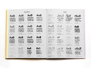
Typefaces For Editorial Design


This is a list of good typefaces for use in editorial design as compiled by the School Of Visual Arts in New York. I have to say that I agree with a lot of these choices, as these are fonts that I often employ in my work as well. This list will also help me when thinking about fonts to use in my context book.

Wednesday 28 July 2010

Interview With Thom Bennett

My interview with Thom Bennett, a graphic designer from Otley:

1) What first made you interested in graphic design, in particular typography and layout?

I was always interested in art and design from an early age - especially technical drawing. Further on, after having worked in agencies for a few years, I began to appreciate the power and simplicity of well structured layouts combined with great use of typography.

2) How did you start out in graphic design, and get yourself noticed in the industry?
I started out in graphic design by doing an A'level in art and design - this led me through education and a job a a print house. I got noticed in the industry through the internet and good publicity of my online portfolio.

To be continued...

Tuesday 27 July 2010

Interview With David Bailey

My interview with David Bailey, creative director of Kiosk, Sheffield and ex-Designers Republic:

1) What first made you interested in graphic design, in particular typography and layout?
I was never interested in typography or layout initially. I was interested in exciting image-lead communication. The type and layout just came with the territory.

I did gain an interest in typography though. My early influences being as diverse as Josef Muller-Brockmann, David Carson, Tomato, and The Designers Republic.

2) How did you start out in graphic design, and get yourself noticed in the industry?
I ran a clubnight in Sheffield with a group of designers/artists/DJs. I would do illustrations for the flyers, which were then artworked up by one of the
designers. Whilst they looked nice, I felt I wanted a stab at composing the final design/layout. So I bought myself a Mac and taught myself how to use Freehand and Photoshop.

During this time I got to know fellow Sheffielder Ian Anderson (owner/director of
The Designers Republic). He encouraged me to pursue my design interests further. I undertook an HND in graphic design and wound up being employed by The Designers Republic.

3) What does an average day consist of for you?
• 60% business matters/correspondence etc
• 38% design time
• 2% lunch.

4) Who/What has been your inspiration for your design work?
Anything and everything. No restrictions, no definitions, no rules.
Just ideas and communication.

5) How much does budget play a part in your design process?
We try to treat every commission, be it well paid, low paid or zero pay, with equal importance. However, studio time and 'working smart' often must play a part in how much time we allot each project. Therefore mental pre-planning is key.

6) How important is the cover of a publication as opposed to the design of the inner spreads?
Both are as important as each other, but have different duties to fulfill.
A cover must draw an audience in. The inner spreads must keep them there.

7) When you develop a design, in what order do you undertake a project and then in which order do you work?
1. Switch on brain
2. Sketch ideas (sometimes)
3. Switch on computer
4. Design

8) What attributes should a good layout have and why?
Contrast and space. If everything were the same size and spaced equally we'd get bored, walk away, and thus learn nothing. Good editorial design should be influenced by good editorial content.

9) What considerations need to be made when developing a layout for editorial design?
The audience.

10) Which publications do you think are particularly well designed?
Monocle (magazine)
The Guardian

11) Where do you see editorial design heading in the future?
Everywhere, thanks to mobile devices.

12) Anything else you’d like to add, or any other advice you could give to a budding designer?
Have fun. Have a plan B.
;-)

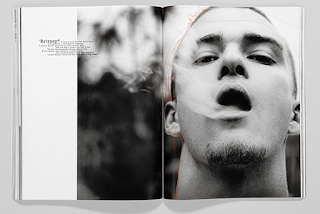
Baron & Baron, Inc.


Baron & Baron, Inc. was founded by the renowned creative director Fabien Baron. He works extensively in high fashion; building brands and designing print and motion advertising campaigns, editorial, packaging and product and furniture design. His editorial work is very clean, minimalistic and clinical but I think that works well with high-end brands as it kind of adds to the air of snobbery that surrounds luxury products & celebrities. I have to admit that this is the kind of thing I think of when I think of spreads in Vogue, Elle etc. Almost all of his work is completely black & white, theres only one tiny bit of red out of all of these spreads, an interesting choice which I think shows Baron's authoritative yet artistic style.