Thursday, 19 August 2010

Near completion!


This is an upload of all the content pages together. From this I can see that the colour is completely wrong, I knew it would be as its a Pantone and lulu won't support that so thats one thing that needs to be changed. I also need to edit the contents page so its correct, edit the page numbers at the bottom of each page and change the section headings in the top right. Otherwise I think its looking quite good. I tried to get a good balance between image and text and structure it so it flows well. So far I think I have achieved these things. I also have to finish some cover designs but the book will DEFINITELY be sent to print tomorrow.

Typography Pages


The pages about type for editorial design. Most of the copy is from Zappaterra's Editorial Design. I felt it was important to add some bold images as a way of illustrating the type as there was a lot of information to write. Images are from Deanne Cheuk and the NY Times magazine.

Editorial Design Future


Finished the future of editorial design pages. The copy is half written by me, half from the article on Pentagram's blog that I posted earlier. The quotes are from email interviews I did and the image is from http://mediamemo.allthingsd.com/20100803/another-magazine-app-yep-but-this-ones-for-the-ladies-conde-nast-brings-glamour-to-the-ipad/.

Update


Some more pages that I've created/edited including contents, analysis of a front cover and an analysis of the poor design features of Pick Me Up. Now I just have to finish the sections on typography, layout the future of editorial design and design the cover!

Wednesday, 18 August 2010

Cover Ideas


I drew out a few ideas for a cover design. I either want to go with a minimalist style a la grafik magazine or use the traditional visual language of a magazine cover with the title at the top, image in the middle and key features listed down the sides - not sure what image would go in the middle but perhaps it would work with type alone.

Tuesday, 17 August 2010

Developing Sections


For the inspiration section, I tried to use the same background for all off them as a way of showing that these link as one section of the book but I thought it looked too boring, so I'm going back to the different colour blocks behind the content.


I decided on a final design for the section of my work and did an introduction page to editorial design basics. Might change this to include a list of all the things this section will look at. I like this style so will use this for the rest of this section.


Page about production cycles of magazines depending on whether they're daily, weekly or monthly.


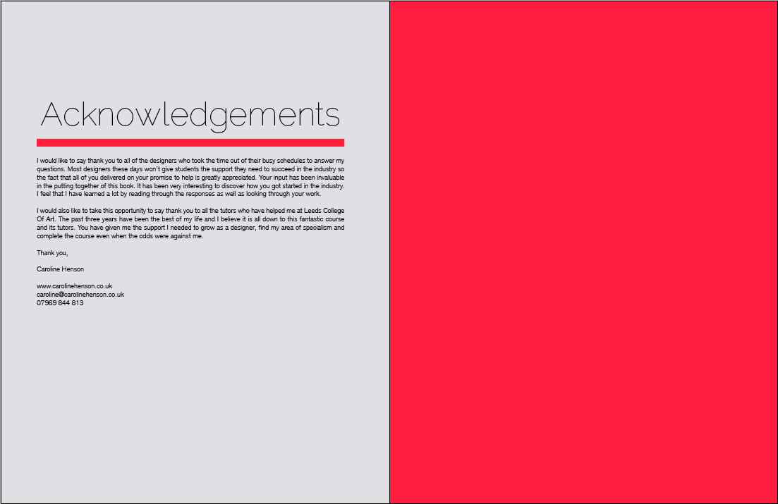
And I did the bibliography and acknowledgments pages too. The main things left to do are the cover, contents, magazine dissection, typography, layout, budget, unsuccessful design and future of design. Due to the interviews and inspiration getting messed about here is an updated structure:

Effective Editorial Design
Contents
Introduction
- About my design practice and why I have chosen to look at editorial design
- Influence on my work
Editorial Design Basics
- Production cycles
- Dissection of a magazine cover
- Type
- Layout
- Budget
Unsuccessful Editorial Design
The Future Of Editorial Design
Inspiration
- &Smith
- D8
- Deep
- Design Has No Name
- Emily Tu
- Form
- No Zine
- Nylon
- Pentagram
- Public
- Purpose
- Shaz Madani
- Sort Design
- The Consult
- Thirteen
Interviews
- Matt Austin
- David Bailey
- Axel Feldmann
- Holger Jacobs
- Ken Leung
Bibliography
Acknowledgements

Saturday, 14 August 2010

Final Interview Layouts

Finally finished the interview designs!! I'm pretty happy with these, they took a lot of work to get right but I think they look quite good. Thats 2 sections done, now to start doing the editorial design info pages. The neon orange varies between blog posts but thats because of overprint previewing them. The final print will hopefully be using the neon colour or as close as lulu can get it.