I can't believe I've not done a post on this already as this is my favourite magazine in terms of how its designed as well as having interesting content.
From wikipedia:
Nylon is an American magazine that focuses on pop culture and fashion. Its coverage includes art, beauty, music, design, celebrities, technology and travel. The name Nylon derives from the magazine's often featured articles on "self-willed sibling-cities New York and London".
Nylon was co-founded by ex-Ray Gun publishers Marvin Scott Jarrett & Jaclynn Jarrett, Ray Gun Editorial Director Mark Blackwell, American entrepreneur Michael "Mic" Neumann, and supermodel Helena Christensen. Christensen is no longer involved with the magazine. The Executive Editor for the magazine is currently Stephanie Trong who also holds the same position for Nylon Guys .
Past cover models have included: The Horrors, Lily Allen, Paris Hilton, The Kills, Christina Aguilera, Camilla Belle, Karen O, Mary-Kate Olsen, Zooey Deschanel, Kristen Stewart, Rachel Bilson, Scarlett Johansson, Mischa Barton, Christina Ricci, Leighton Meester, Blake Lively, Taylor Momsen, The White Stripes, Sienna Miller, Nicole Richie, Megan Fox, Hilary Duff, and Lindsay Lohan. The first person to ever grace the cover of Nylon was Liv Tyler in April 1999.
The magazine has Radar, Fashion, and Style pages. There is also a Nylon Guys magazine who has featured Joseph Gordon Levitt from 500 Days of Summer. Nylon magazine has gives readers insight on new fashions and up and coming artists such as the Vivian Girls form their latest issue the Indie Spotlight. Nylon is noted for its bright and bold colors and simple statements. Nylon is read all over the world from Okinawa to Austria.
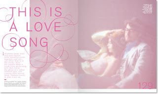
What I like about Nylon is that the designers make me want to read it. Obviously I love fashion and popular culture so I'm already attracted to the subject matter but when I'm just reading through it I'm always drawn to the design elements. I always think to myself "I like how they've done that bit of type there" or "This has exactly the right balance of content and white space" and of course these are incredibly geeky things to pick up on when reading a magazine but hey, I'm a graphic designer for god's sake, this is what we do!
The covers are always simple. A white background, the cover star, features down the sides and the Nylon logo at the top - using Futura Extra Bold - in different colours. In past issues they used a different font on each cover to highlight the person on the cover star. The October 2008 issue with actress and singer Zooey Deschanel on the front is often picked out as fan favourite with many of them saying they loved the font choice for her name:
I don't think its actually a font, I think its handmade which adds to the beauty of it. I love the modernist fonts they use. They have managed to mix hand rendered type and bold sans-serifs seamlessly. The colour choices of pretty pastels and plain black colours don't contradict each other either. I think all these design choices work really well together to show that this is essentially a fashion magazine but it has a lot more body copy and a lot more original content than the likes of Vogue etc. I think the fact that it was founded by the people who published Ray-Gun magazine speaks volumes as that is always considered to be highly design-led.
Nicole Michalek and Kristin Eddington are the designers at Nylon. I might be wrong but judging from her website, I think Kristin does most of the typographic designs. I'm gonna see if I can get an interview with either of them as I absolutely love what they do. Here are some examples of the lovely spreads within Nylon:
Bibliography
15 years ago


No comments:
Post a Comment